


Great Tables gives you a grammar for assembling presentation-quality display tables in Python. You start from a DataFrame, declare which parts of the table mean what (the stub, the row groups, the column labels), and then layer on formatting, styling, and annotation until the table communicates exactly what you intend. The library has always taken much of its design from the gt R package, and over successive releases the Python version has been steadily catching up to the capabilities that R users have enjoyed for years.
The v0.22.0 release is the largest step in that direction so far. It
introduces footnotes, group-wise summary rows, a family of
column-merging methods, a suite of text transformations, several
value-substitution helpers, two new formatting methods, and a modern
image-export pipeline through gtsave(). The LaTeX output gained the
ability to render stubs and row groups, and Pandas is no longer a
required dependency. There is a great deal to cover, so this post walks
through each addition in turn, with a small working example for every
one.
Footnotes with tab_footnote()#
Footnotes are one of the oldest conventions in tabular presentation, and
they solve a real problem: sometimes a value, a label, or a heading
needs a short explanation that would clutter the table if placed inline.
The new tab_footnote() method attaches a footnote to any location in
the table and manages the marks for you, numbering them sequentially in
the order they appear and collecting the notes themselves in the table’s
footer.
A location is specified with one of the loc.* helpers, the same ones
used elsewhere in the library for styling. You can attach a note to
cells in the stub, to a column label, to the subtitle, or to body cells.
Because the footnote text accepts md() and html(), you can format it
with Markdown or raw HTML just as you would any other piece of table
content.
import polars as pl
from great_tables import GT, loc, md
from great_tables.data import towny

towny_mini = (
    pl.from_pandas(towny)
    .filter(pl.col("csd_type") == "city")
    .select(["name", "density_2021", "population_2021"])
    .top_k(10, by="population_2021")
    .sort("population_2021", descending=True)
)

(
    GT(towny_mini, rowname_col="name")
    .tab_header(
        title=md("The 10 Largest Municipalities in `towny`"),
        subtitle="Population values taken from the 2021 census.",
    )
    .fmt_integer()
    .cols_label(density_2021="Density", population_2021="Population")
    .tab_footnote(
        footnote="Part of the Greater Toronto Area.",
        locations=loc.stub(rows=[
            "Toronto", "Mississauga", "Brampton", "Markham", "Vaughan"
        ]),
    )
    .tab_footnote(
        footnote=md("Density is in terms of persons per {{km^2}}."),
        locations=loc.column_labels(columns="density_2021"),
    )
    .tab_footnote(
        footnote="Census results made public on February 9, 2022.",
        locations=loc.subtitle(),
    )
    .opt_footnote_marks(marks="letters")
)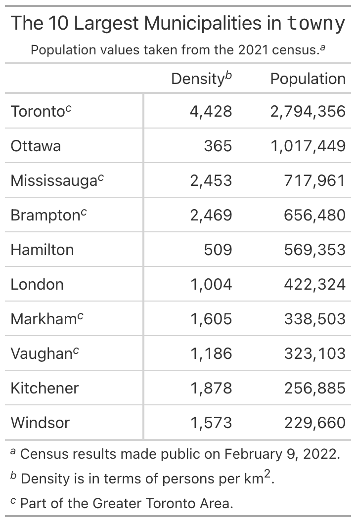
The marks themselves are configurable through opt_footnote_marks().
The default is a standard set of typographic symbols, but you can switch
to numbers or letters, as we did above with marks="letters". The
placement= argument on tab_footnote() controls whether a mark sits
to the left or right of the cell content, and the default "auto"
chooses a side based on the cell’s alignment.
Group-wise summaries with summary_rows()#
When a table is divided into row groups, readers frequently want a
per-group summary: a total, a mean, a minimum and maximum. The
summary_rows() method computes these and inserts them as labeled rows
within each group, either at the bottom (the default) or at the top.
The aggregations are described with the fns= argument, a dictionary
whose keys become the row labels and whose values are the expressions to
evaluate. The expressions can be Polars expressions, which is the most
concise option when your data is a Polars DataFrame, or plain Python
callables that receive a DataFrame subset. A formatting function from
the vals.* family can be passed through fmt= so that the summary
values match the formatting of the rest of the table.
import polars as pl
from great_tables import GT, vals
from great_tables.data import gtcars

gtcars_mini = (
    pl.from_pandas(gtcars)
    .select(["mfr", "model", "hp", "trq"])
    .head(12)
)

(
    GT(gtcars_mini, rowname_col="model", groupname_col="mfr")
    .summary_rows(
        fns={
            "Min": pl.col("hp", "trq").min(),
            "Max": pl.col("hp", "trq").max(),
        },
        fmt=vals.fmt_integer,
    )
)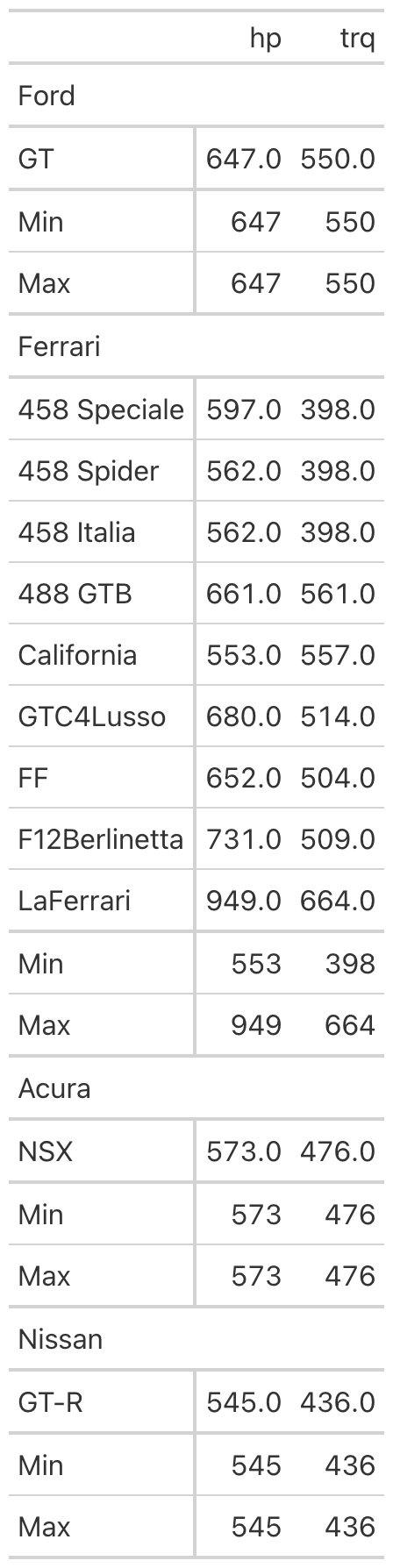
By default the summary applies to every group, but the groups=
argument narrows it to a named subset when you only need summaries in
certain places. The release also includes grand_summary_rows(), a
companion method that produces a single summary across the entire table
rather than one per group. Both kinds of summary can be targeted for
styling through loc.summary() and loc.grand_summary(), so you can
shade them or set them apart from the regular body rows.
Merging columns together#
Tables often hold several columns that, conceptually, describe a single quantity. A value and its uncertainty, the lower and upper ends of a range, or a count paired with its percentage all read better as one column than as two. The release adds a family of merge methods for exactly these situations, along with a generic method for everything else.
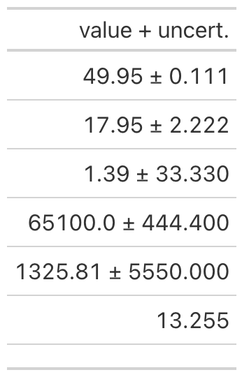
The most specialized of these is cols_merge_uncert(), which combines a
measured value with its uncertainty and renders the pair with a
plus-or-minus separator. You provide the value column and the
uncertainty column, and the second column is hidden automatically once
it has been folded into the first.
from great_tables import GT
from great_tables.data import exibble
import polars as pl

exibble_mini = (
    pl.from_pandas(exibble)
    .select("num", "currency")
    .slice(0, 7)
)

(
    GT(exibble_mini)
    .fmt_number(columns="num", decimals=3, use_seps=False)
    .cols_merge_uncert(col_val="currency", col_uncert="num")
    .cols_label(currency="value + uncert.")
)
The cols_merge_range() method works the same way for a pair of columns
that mark the beginning and end of a range, joining them with an en dash
by default (the separator is adjustable through sep=). The
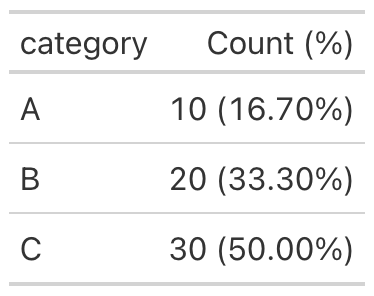
cols_merge_n_pct() method pairs a count with a percentage, rendering
values in the familiar 10 (16.70%) form and suppressing the percentage
when the count is zero.
from great_tables import GT
import polars as pl

df = pl.DataFrame({
    "category": ["A", "B", "C"],
    "n": [10, 20, 30],
    "pct": [0.167, 0.333, 0.500],
})

(
    GT(df)
    .fmt_percent(columns="pct")
    .cols_merge_n_pct(col_n="n", col_pct="pct")
    .cols_label(n="Count (%)")
)
For anything that does not fit those three patterns there is the generic
cols_merge(), which takes a list of columns and a pattern= template.
The template uses zero-based indices in braces to refer to the columns,
so a pattern of "{0} to {1}" interleaves the first and second columns
with the literal text between them. The first column named becomes the
visible, merged column, and the rest are hidden by default. This is the
general mechanism on which the specialized methods are built, and it is
the right tool when your desired arrangement is unusual.
A related convenience is cols_reorder(), which rearranges every column
in a single call. Previously, a full reordering meant a sequence of
cols_move_*() invocations; now you can list the columns in the order
you want and have the table laid out accordingly. The method expects
every column to appear exactly once, raising an error if any are omitted
or duplicated, which guards against the silent loss of a column.
from great_tables import GT
from great_tables.data import exibble

exibble_mini = exibble[["num", "char", "fctr", "date", "time"]]

(
    GT(exibble_mini)
    .cols_reorder(["fctr", "date", "time", "char", "num"])
)
A suite of text transformations#
Formatting methods handle numbers, dates, and currencies, but cell
content sometimes needs a transformation that no formatter anticipates.
The release introduces four text_*() methods that operate on the
rendered text of cells, each addressing a different shape of problem.
The most general is text_transform(), which applies an arbitrary
function to the text of the targeted cells. The function receives the
cell’s current string and returns a new one, which makes it suitable for
any transformation you can express in Python. Because it runs after
formatting, you can format a value first and then decorate the result.
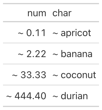
from great_tables import GT, loc, exibble

(
    GT(exibble[["num", "char"]].head(4))
    .fmt_number(columns="num", decimals=2)
    .text_transform(
        locations=[loc.body(columns="num"), loc.body(columns="char")],
        fn=lambda x: f"~ {x}",
    )
)
When the transformation is a regular-expression substitution,
text_replace() is more direct. It takes a pattern= and a
replacement=, and it supports capture groups, so you can wrap or
rearrange matched text. The example below finds parenthetical text and
emphasizes it with HTML tags.
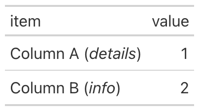
import pandas as pd
from great_tables import GT, loc

df = pd.DataFrame({
    "item": ["Column A (details)", "Column B (info)"],
    "value": [1, 2],
})

(
    GT(df)
    .text_replace(
        pattern=r"\((.+?)\)",
        replacement=r"(<em>\1</em>)",
        locations=loc.body(columns="item"),
    )
)
The remaining two methods cover conditional replacement.
text_case_match() is a switch-like construct: each case is a tuple
pairing one or more values to match against a replacement string, with
an optional default= for everything unmatched. text_case_when()
generalizes this to predicates, where each case pairs a function that
returns a boolean with the replacement to use when it is true. The case
ordering matters, since the first matching predicate wins, which makes
it a natural fit for binning a numeric column into labels.
import pandas as pd
from great_tables import GT, loc

df = pd.DataFrame({"score": [95, 72, 88, 61, 100]})

(
    GT(df)
    .fmt_number(columns="score", decimals=0)
    .text_case_when(
        (lambda x: int(x) >= 90, "A"),
        (lambda x: int(x) >= 80, "B"),
        (lambda x: int(x) >= 70, "C"),
        default="F",
        locations=loc.body(columns="score"),
    )
)
Substituting specific values#
Closely related to text transformation is the act of replacing
particular values for the sake of readability. A column of measurements
might contain values too small to be meaningful, or zeros that would be
better shown as a dash, or missing entries that should read as something
other than a blank. The release adds a family of sub_*() methods for
these cases: sub_missing() for missing values, sub_zero() for zeros,
sub_small_vals() and sub_large_vals() for values beyond a threshold,
and the general sub_values() for replacing any specified value.
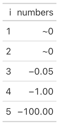
The small-value substitution is representative. It replaces values whose
magnitude falls below a threshold= with a chosen pattern, which is
useful when very small numbers carry no real information and only
distract. The sign= argument restricts the substitution to positive or
negative values, so you can treat the two tails of a distribution
differently.
from great_tables import GT
import polars as pl

neg_vals_df = pl.DataFrame({
    "i": range(1, 6),
    "numbers": [-0.0001, -0.005, -0.05, -1.0, -100.0],
})

(
    GT(neg_vals_df)
    .fmt_number(columns="numbers")
    .sub_small_vals(sign="-", threshold=0.01, small_pattern="~0")
)
These methods operate on the underlying values rather than on rendered text, so they compose cleanly with the formatting methods. You decide what counts as missing, zero, small, or large, and the table presents those cases consistently wherever they occur.
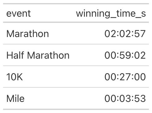
Two new formatters: durations and parts-per#
The formatting family gained two members. The first, fmt_duration(),
renders durations in any of several styles. Numeric inputs are
interpreted according to an input_units= setting (seconds, minutes,
hours, days, or weeks), while Polars Duration columns are detected
automatically. The duration_style= argument selects between a narrow
style such as 5d 3h, a wide style such as 5 days, 3 hours, a
colon-separated style such as 02:15:30, and ISO 8601. The example
below renders race times as zero-padded HH:MM:SS.
import pandas as pd
from great_tables import GT

df = pd.DataFrame({
    "event": ["Marathon", "Half Marathon", "10K", "Mile"],
    "winning_time_s": [7377, 3542, 1620, 233],
})

(
    GT(df)
    .fmt_duration(
        columns="winning_time_s",
        input_units="seconds",
        duration_style="colon-sep",
        output_units=["hours", "minutes", "seconds"],
    )
)
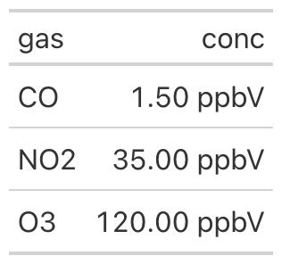
The second formatter, fmt_partsper(), handles parts-per quantities:
per-mille, parts per million, parts per billion, and finer scales still.
The to_units= argument names the target quantity, the values are
scaled to match unless you opt out with scale_values=False, and the
symbol is rendered appropriately for both HTML and LaTeX output. The
example formats gas concentrations as parts per billion by volume.
import polars as pl
from great_tables import GT

concentrations = pl.DataFrame({
    "gas": ["CO", "NO2", "O3"],
    "conc": [1.5, 35.0, 120.0],
})

(
    GT(concentrations)
    .fmt_partsper(
        columns="conc",
        to_units="ppb",
        scale_values=False,
        symbol="ppbV",
    )
)
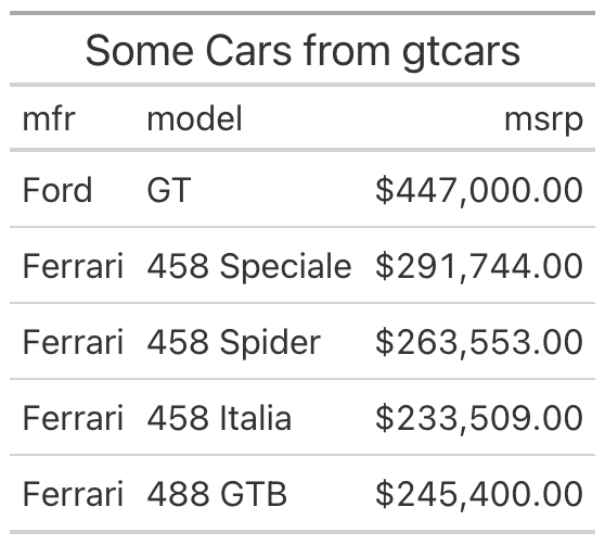
Saving tables as images with gtsave()#
A display table is often destined for a slide deck, a report, or a
README, and in those settings you need an image rather than live HTML.
The new gtsave() method produces one by rendering the table in a
headless instance of Chrome and capturing it. It writes PNG, JPEG, WebP,
and PDF, choosing the format from the file extension you supply.
from great_tables import GT
from great_tables.data import gtcars
import polars as pl

gtcars_mini = (
    pl.from_pandas(gtcars)
    .select(["mfr", "model", "msrp"])
    .head(5)
)

(
    GT(gtcars_mini)
    .tab_header(title="Some Cars from gtcars")
    .fmt_currency(columns="msrp")
    .gtsave("my_table.png")
)
Several arguments control the capture. The zoom= factor governs the
resolution of raster output, with higher values producing sharper
images, while expand= adds padding around the table and
vwidth=/vheight= set the viewport. The gtsave() method replaces
the older save(), which is now deprecated; existing code will continue
to work for the time being, but new work should use gtsave().
Better LaTeX output#
Great Tables can render to LaTeX as well as HTML, and that path received substantial attention in this release. LaTeX output now supports the stub and row groups, including spanning column headers and the row-group-as-column layout, which means that tables relying on these structural features are no longer limited to HTML. In addition, Markdown and HTML content placed in cells, headers, or footnotes is now converted to its LaTeX equivalent during rendering, so styled text survives the trip into a LaTeX document rather than appearing as literal markup. For anyone producing tables destined for a paper or a typeset report, the LaTeX output is now much closer in capability to the HTML output.
Polars without Pandas#
Until now, Great Tables required Pandas even if all of your work was in Polars. As of this release, Pandas is an optional dependency, and the library is fully functional with Polars alone. For Polars-first projects and for lightweight environments where every dependency counts, this removes a sizable transitive install that was not actually needed. Pandas users are unaffected: a DataFrame from either library works as input exactly as before, and the choice of backend remains yours.
Getting started#
Great Tables v0.22.0 is available now on PyPI, so a
pip install great-tables (or an upgrade of an existing install) brings
everything described here. The documentation
site, which moved to Great
Docs as its generator in this
release, covers each method in detail with runnable examples, and the
User Guide has
been updated to reflect the new features. The GitHub
repository holds the source,
the full changelog, and the issue tracker. This release also welcomed
several first-time contributors, and if you would like to join them, or
simply have a feature to request or a bug to report, the issue tracker
is the place to start.